import sklearn
Important
Aggregating shap values can give more detailed alternatives to permutation importance and partial dependence
A note on SHAP Values
- Shap values show how much a given feature changed our prediction (compared to if we made that prediction at some baseline value of that feature)
- Harder to calculate with the sophisticated models we use in practice
- Through some algorithmic cleverness, Shap values allow us to decompose any prediction into the sum of effects of each feature value
Visualizations
- These visualizations have conceptual similarities to permutation importance and partial dependence plots
- Summary plot – permutation importance
- Permutation importance helps us get some insights and graphics on which feature matter, but they don’t provide information on how each individual feature matter. If a feature has medium permutation importance, that could mean it has
- a large effect for a few predictions, but no effect in general, or
- a medium effect for all predictions.
- Here SHAP can give a bird’s eye view of which feature are important and what is driving it. Summary plot is made of many dots. Each dot has three characteristics:
- Vertical location shows what feature it is depicting
- Color shows whether that feature was high or low for that row of the dataset
- Horizontal location shows whether the effect of that value caused a higher or lower prediction.
- Permutation importance helps us get some insights and graphics on which feature matter, but they don’t provide information on how each individual feature matter. If a feature has medium permutation importance, that could mean it has
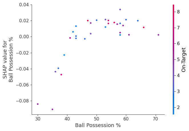
- Contribution plot – partial dependence plot
- We’ve previously used Partial Dependence Plots to show how a single feature impacts predictions. These are insightful and relevant for many real-world use case.Plus, with a little effort, they can be explained to a non-technical audience.But there’s a lot they don’t show. For instance, what is the distribution of effects? Is the effect of having a certain value pretty constant, or does it vary a lot depending on the values of other feaures. SHAP dependence contribution plots provide a similar insight to PDP’s, but they add a lot more detail.
- Summary plot – permutation importance
- These visualizations have conceptual similarities to permutation importance and partial dependence plots
from aiking.data.external import *
import numpy as np
import pandas as pd
from sklearn.model_selection import train_test_split
from sklearn.ensemble import RandomForestClassifier
from sklearn.tree import DecisionTreeClassifier, plot_tree
from sklearn.inspection import PartialDependenceDisplay
import seaborn as sns
import matplotlib.pyplot as plt
import pdpbox
import graphviz
import panel as pn
from ipywidgets import interact
import shap
path = get_ds('fifa-2018-match-statistics'); path.ls()[0]Path('/Users/rahul1.saraf/rahuketu/programming/AIKING_HOME/data/fifa-2018-match-statistics/FIFA 2018 Statistics.csv')df = pd.read_csv(path/"FIFA 2018 Statistics.csv"); df
y = (df['Man of the Match'] == "Yes"); y
X = df.select_dtypes(np.int64); X
df_train, df_val, y_train, y_val = train_test_split(X, y, random_state=1)
df_train.shape, df_val.shape, y_train.shape, y_val.shape
model_rf = RandomForestClassifier(random_state=0).fit(df_train, y_train); model_rfRandomForestClassifier(random_state=0)In a Jupyter environment, please rerun this cell to show the HTML representation or trust the notebook.
On GitHub, the HTML representation is unable to render, please try loading this page with nbviewer.org.
RandomForestClassifier(random_state=0)
explainer=shap.TreeExplainer(model_rf); explainer<shap.explainers._tree.TreeExplainer at 0x2aa49ff10>Summary Plot
shap_values = explainer.shap_values(df_val); shap_values.shape(32, 18, 2)shap_values[1].shape(18, 2)shap.summary_plot(shap_values[:,:,1], df_val)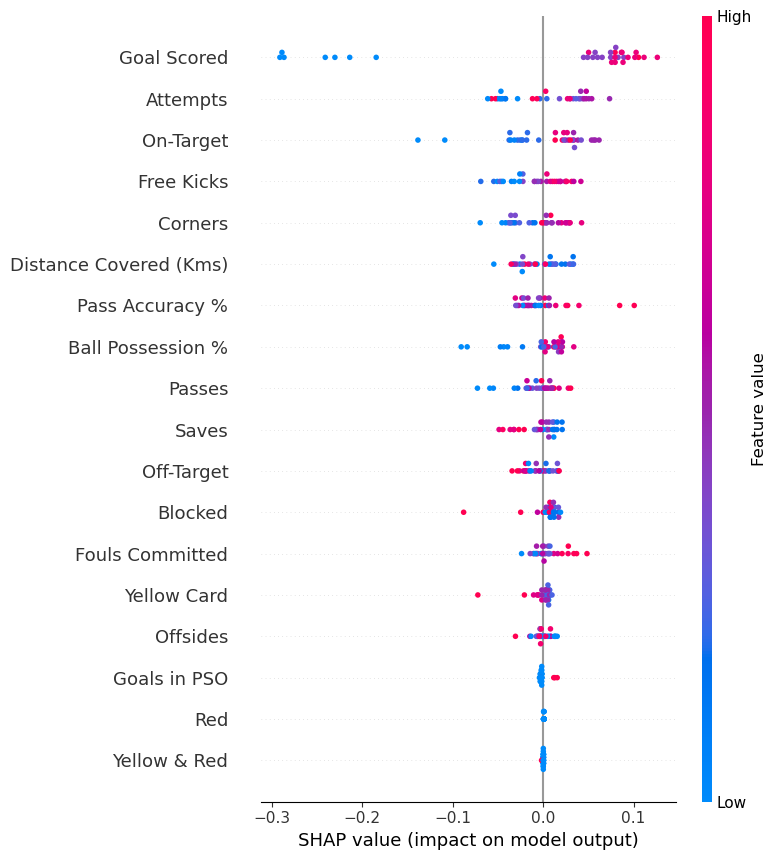
Dependence Contribution Plot
shap.dependence_plot('Ball Possession %', shap_values[:,:,1], df_val, interaction_index="Goal Scored")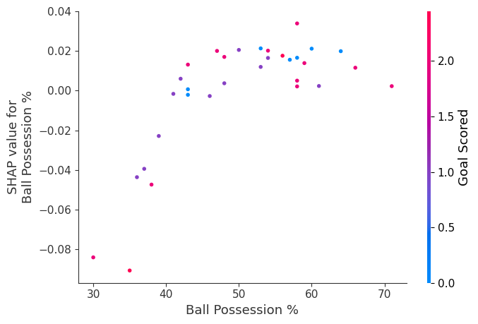
The spread suggests that other features must interact with Ball Possession %.
shap.dependence_plot('Ball Possession %', shap_values[:,:,1], df_val)